back to portfolio
08/2026
back to portfolio
08/2026
back to portfolio
08/2026
back to portfolio
08/2026
From scattered spreadsheets to one clear picture.
The original product was developed inside a large healthcare company between 2020 and 2024. I worked as the solo designer throughout the project. The wider team included a Product Owner, Business Analyst, Tech Lead, and contracted frontend and backend developers.
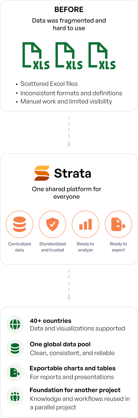
The project started from a real internal need: one place to collect, compare, and visualize disease-monitoring data worldwide. Before the platform existed, country teams worked mostly in Excel. They gathered data from local authorities or organizations responsible for data collection, stored it in their own files, and ran analysis in those same spreadsheets.
The goal was to create one shared web application where users could explore country data, view trends, open detailed visualizations, and export charts or tables for further use. The product grew over several years as more countries and datasets were added.
Strata is an anonymized redesign of that platform. The company, original product name, medical domain, internal screenshots, and proprietary data have been removed. Public COVID-19 data is used because it supports the same information architecture without exposing internal material.
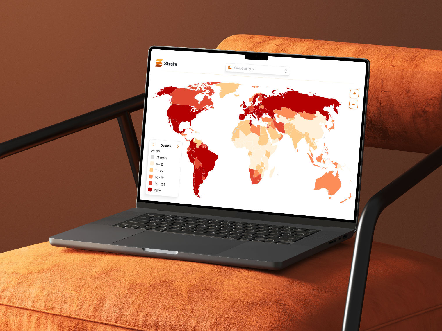
There was no central repository for disease-monitoring data. Country teams stored information in separate Excel files, often using different structures and naming conventions. Excel had become the storage layer, analysis tool, and reporting format at the same time. Local teams worked with local data, global analysts needed access to a standardized international dataset, and stakeholders often wanted clear visual outputs for presentations.
The core problem was to turn scattered country-level data into one shared system that supported analysis, visualization, and export.


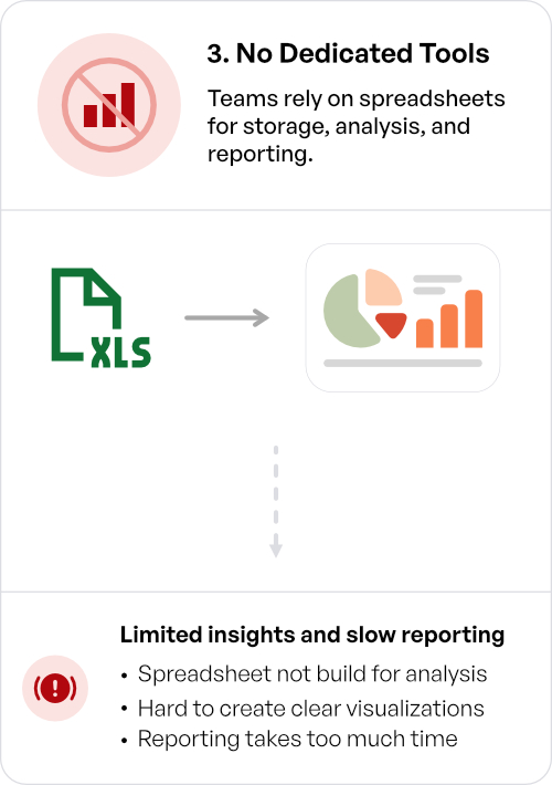

The core problem
Scattered, inconsistent data and spreadsheet-based work make it hard to analyze, compare, and deliver clear insights.
Research ran throughout the project. Early sessions helped us understand how countries worked with their data, while later sessions focused on individual visualizations and new requirements.
Discovery involved five representatives from local country teams and three users from the global team. The sessions focused on their actual way of working. We asked where their data came from, how they stored it, what kind of analysis they performed, and how they shared the results. Three findings shaped the product.
These findings gave the product a clear direction: centralize the data, standardize its structure, and make the results easier to explore.
Research did not stop once the first design was approved. When a country needed a new visualization or an adjustment to an existing view, we spoke directly with its representative. The goal was to understand the actual task before adding another chart or control.
New concepts were tested through interactive prototypes. High-fidelity designs were reviewed with users and stakeholders before development, and the team continued validating major changes during implementation. Analytics, satisfaction surveys, and formal usability testing after larger releases also helped improve the platform over time.
The process section has two parts: the original product work and the later Strata redesign.
The original product was designed from scratch. I started with discovery research, then translated the findings into the main product structure: a global overview, country-level detail, visualizations, tables, and export actions.
The work on visualizations took a large part of the design phase. Different users needed different views of the same data, so each chart had to be tested against a real task rather than chosen only because it looked suitable.
After the first high-fidelity concepts were approved, I continued designing features during development. I worked closely with the Tech Lead and contracted frontend and backend developers, reviewed implementation, and adjusted the design as technical and data constraints became clearer.
For the redesign, I kept the tested product structure but rebuilt the interface for a public portfolio project. The original proprietary domain was replaced with COVID-19 data from public sources.
I moved directly into high fidelity for this redesign. The information architecture had already been tested through years of work on the original product, and I knew a functional React build would follow the Figma stage. Recreating a low-fidelity phase would have repeated work without answering a new question.
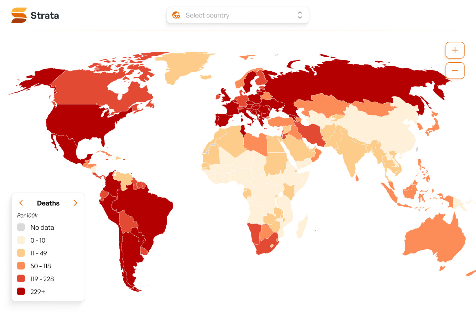
Global map, colored by deaths per 100k


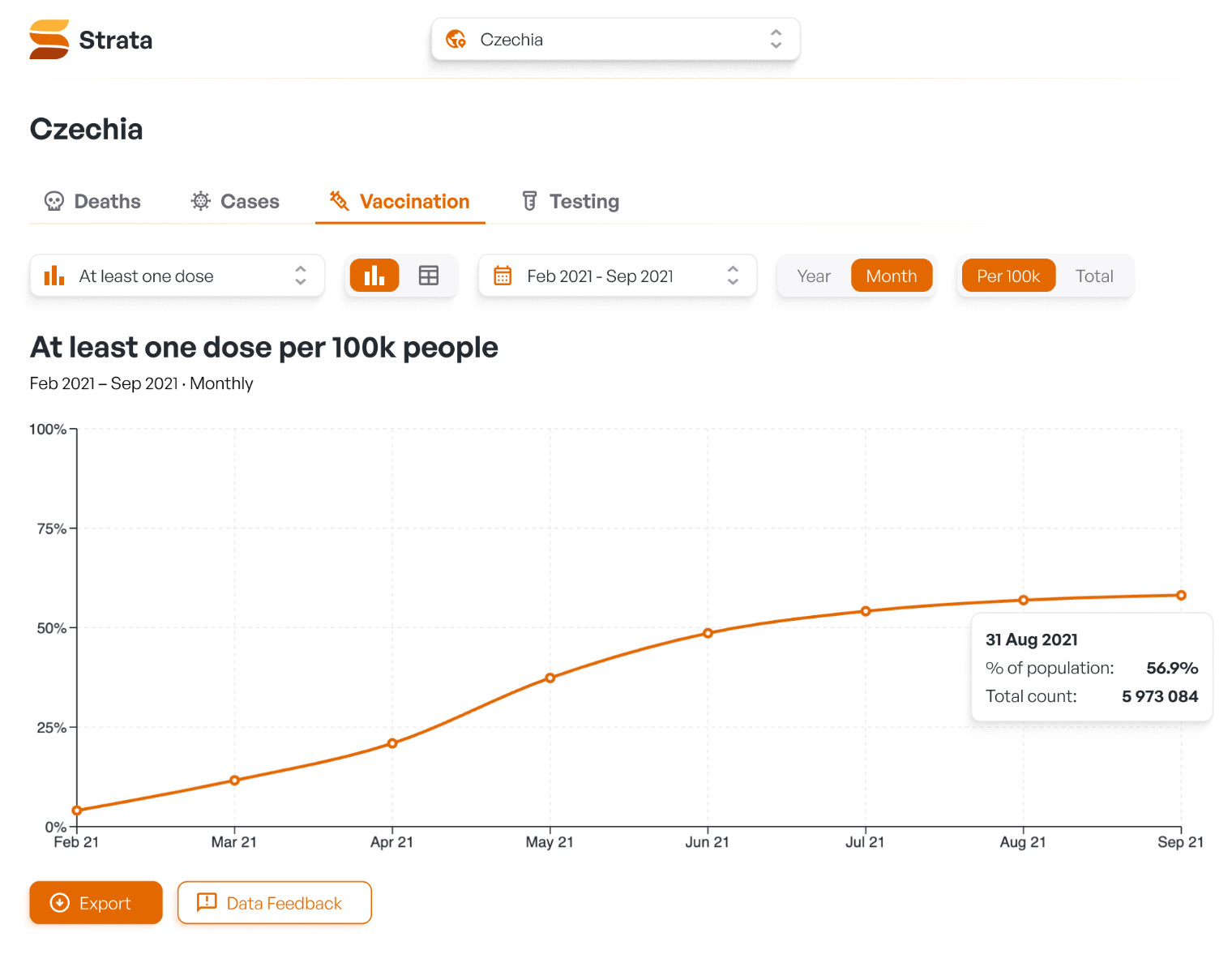
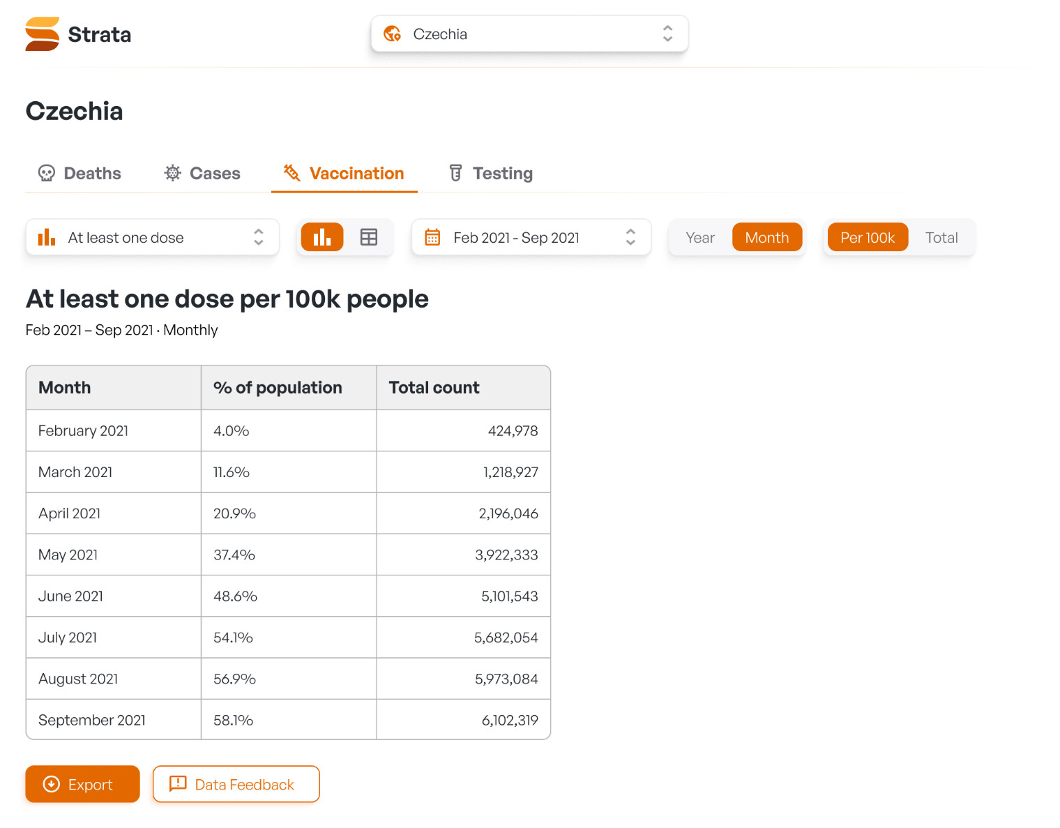
Some decisions came from the original product and years of real use. Others belong to the Strata redesign, where I kept the proven structure but changed parts that could be clearer or more focused.
Export as a primary action. Operational users explored data inside the platform, but many stakeholders consumed the results elsewhere. Charts and tables were often used in reports and presentations, so export could not sit behind several menus as a minor utility. It needed to stay visible on the country dashboard. Users could export the active visualization, its supporting data table, or both.
One platform for different user groups. Country teams, global analysts, and stakeholders did not need the same output. Country teams worked with local detail. Analysts needed standardized views across markets. Stakeholders mainly needed clear visual material they could reuse. Instead of creating separate products, the platform used one shared data source with several ways to access it: a global map, country dashboards, visualizations, tables, and exports.
Country comparison was not worth its cost. The original product included a country-comparison feature. It required substantial design and development effort because users wanted different metrics, time ranges, age groups, and presentation formats. In practice, too few people used it. The ratio between effort and value was weak. Based on that experience, I left the feature out of Strata.
Deaths per 100k as the map metric. The map uses deaths per 100k rather than total deaths. Raw totals make heavily populated countries appear more severe by default. A per-capita metric creates a more useful comparison and tells the intended story more clearly.
Map and search as equal entry points. The map works well for large countries, but small countries can be difficult to select. The searchable country selector gives every country a reliable entry point. Selecting a country from the map or from search leads to the same result: the map zooms in, the country receives a clear selected state, and its summary panel opens. The map gives a global overview. Search provides precision.
Controls are separated by purpose. The original interface placed several controls in the same area, even though they changed different parts of the experience. Strata separates them into clearer levels. The main tabs define the subject, such as Deaths, Cases, Vaccination, or Testing. Secondary controls switch between sub-views when a section contains more than one visualization. The configuration row handles date range, granularity, total versus per-100k values, and chart versus table mode. This makes it easier to understand what each control changes.
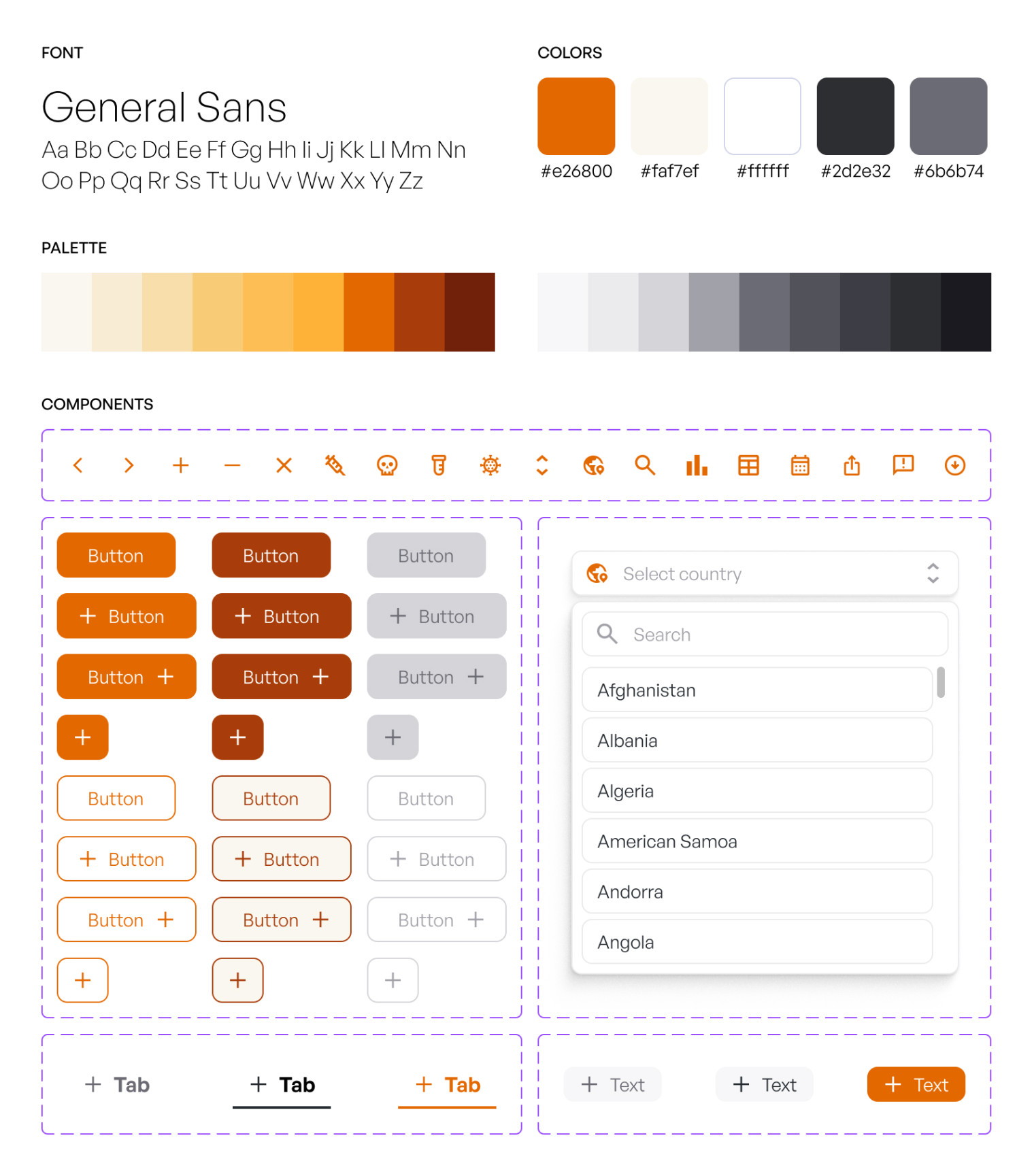
Country users, global analysts, and stakeholders did not use the platform in the same way. Country users worked with local data and needed detail. Analysts needed standardized information across markets. Stakeholders often wanted clear outputs they could place into presentations. The platform used one shared data structure with several ways to access it: map overview, country dashboard, charts, tables, and exports.

One hierarchy, not separate products
Supporting several user groups does not always require separate products. It does require a clear hierarchy between overview, detailed analysis, and reusable outputs.
The hardest problems were not always visible in Figma. Country datasets used different formats, time periods, labels, and structures. Before the team could create a meaningful visualization, the data had to be cleaned and standardized. That work affected every chart and table.
Design follows the data model
A polished visualization cannot repair inconsistent input. The product design had to follow the real data model, not an idealized version of it.
The country-comparison feature looked important during planning. In practice, it required a large amount of work because users wanted different metrics, time ranges, age groups, and presentation formats. The resulting interface was dense, and usage stayed low.
Validate demand earlier
I would validate the expected frequency and purpose of comparison much earlier today. A smaller export-based comparison could probably have covered most real demand with less design and development effort.
The following outcomes belong to the original internal product that Strata is based on.
The platform replaced scattered country-level files with one shared application. Global analysts gained access to a cleaned and standardized data pool, while country users could explore data through visualizations and tables.
The product continued growing as more countries and datasets were added. Ownership later moved to another designer. Its success also led to a parallel internal project that reused knowledge, workflows, and materials created during the original platform's development.