back to portfolio
07/2026
back to portfolio
07/2026
back to portfolio
07/2026
back to portfolio
07/2026
Share what you know and learn what you don't.
Loom started from an internal company need — a better way to share knowledge and connect across teams. The idea came from an employee, not the product team. Someone noticed people inside the company had useful knowledge, but no simple way existed to find the right person to learn from.
Loom wasn't meant to be a course platform or a wiki. Those solve different problems — a course platform is formal and one-directional, a wiki just stores documentation. Loom was built around a more direct exchange: you teach what you know, you learn what you don't, and the app finds the match.
The team was small and multidisciplinary — a Product Manager, a Frontend Developer, a Backend Developer, a Tester, and me as the solo designer. The real product shipped under a different name and with slightly different information architecture. For this case study, I redesigned the experience under the Loom name and removed any reference to the real company, the original name, and internal screenshots.
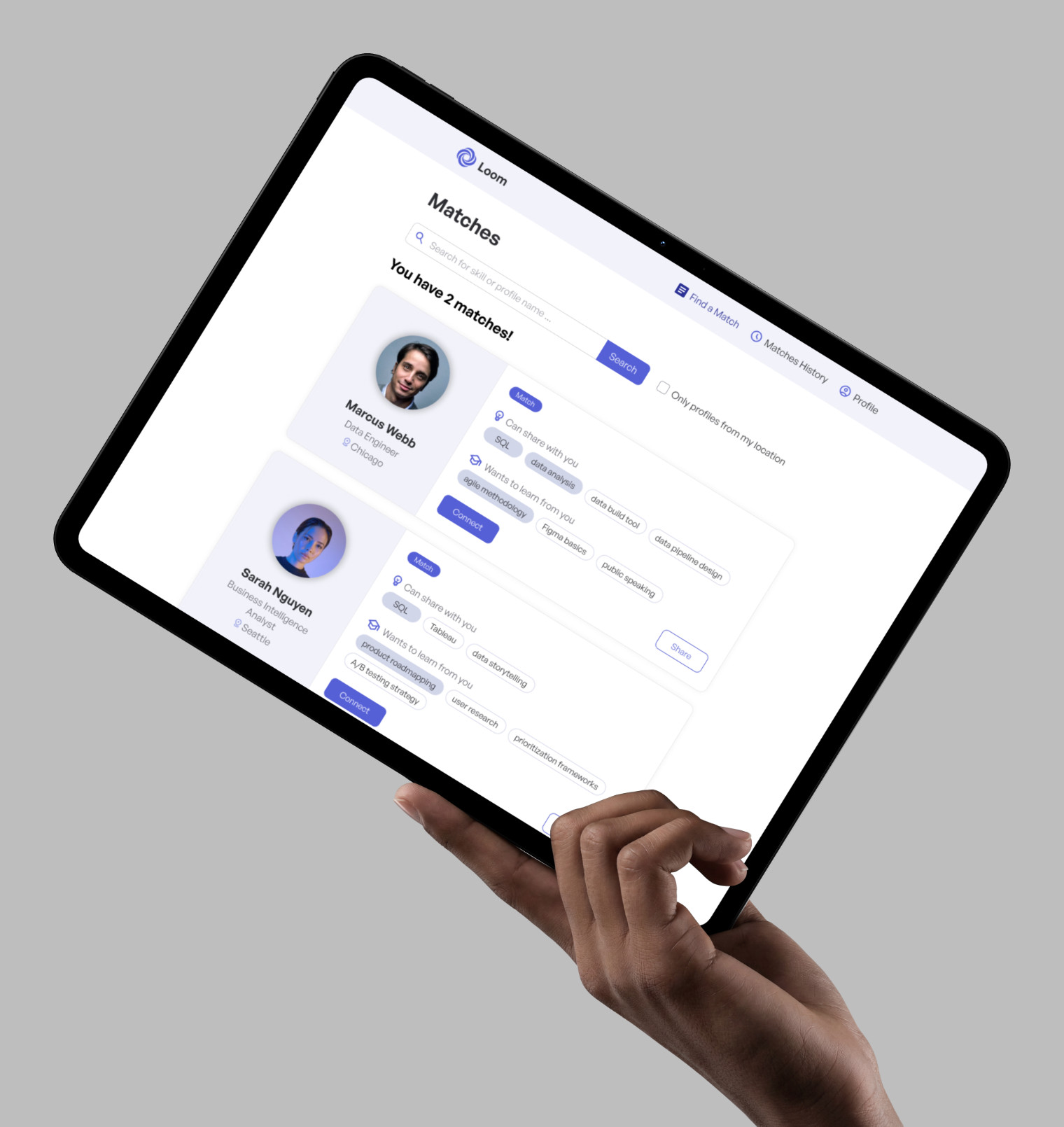
The company had no structured way for employees to learn from each other. Informal channels worked only when someone already knew who to ask, and they broke down the moment you crossed into another department, location, or a larger group. Plenty of people knew SQL, facilitation, product roadmapping, or test automation, but there was no reliable way to reach them. The obvious fix was to reach for an existing internal tool, but none of them actually fit the problem.
The app needed to answer one question directly: who can teach me this, and who wants to learn what I know?

Research happened in two stages. First, we validated whether the idea was worth building and defined the MVP. Later, we tested the MVP with real employees before launch.
Before any design work started, the team wanted to answer one question:
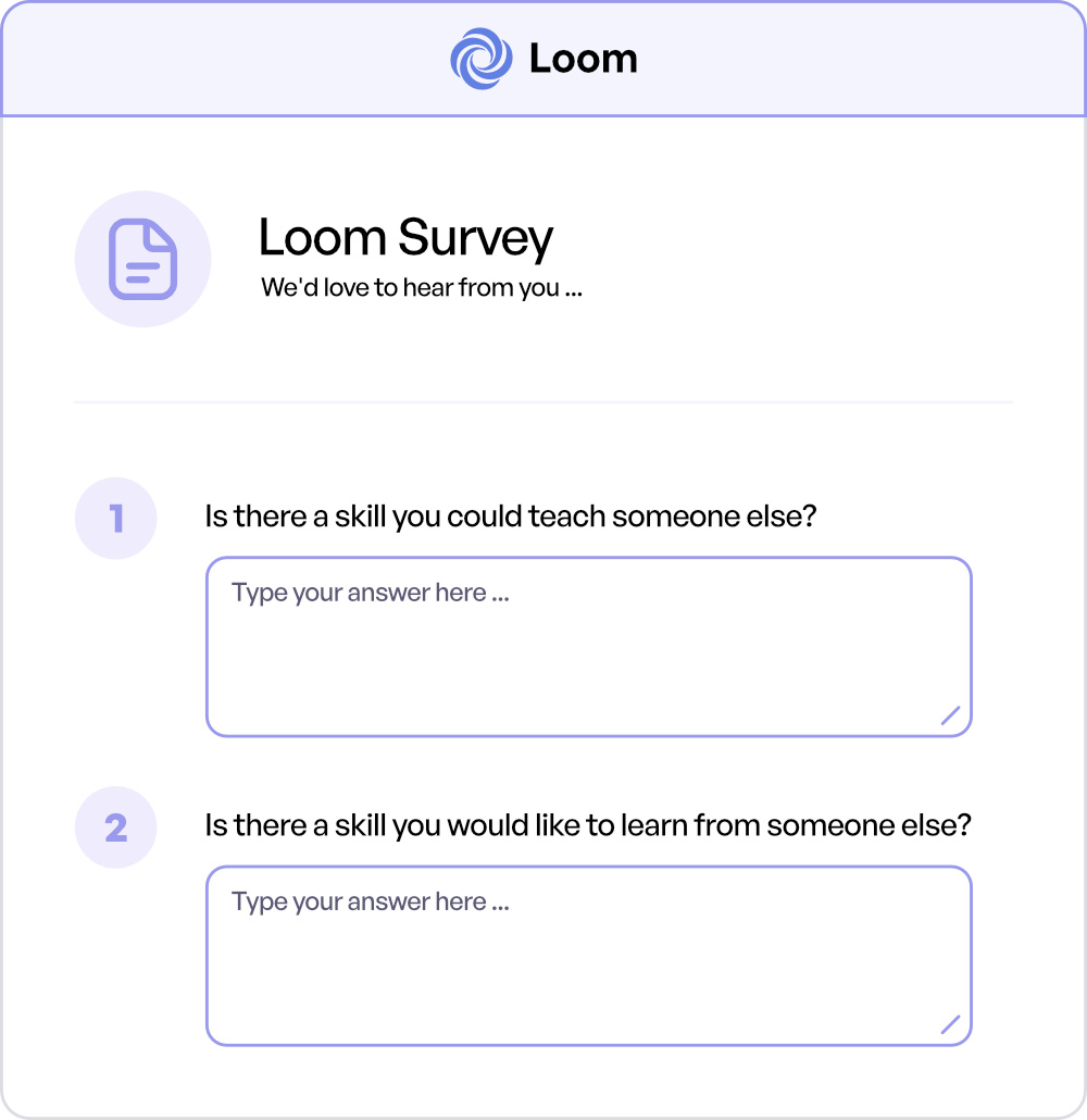
We began with a simple survey sent to around 1,300 employees in Prague. Instead of asking about features, we focused on the core idea behind the product with two questions:
The response rate was lower than we had hoped. Because the survey came from a small product team rather than through an official company communication channel, many employees simply ignored it. Even so, we received enough responses to identify people who were genuinely interested in the concept.
From those responses, we invited ten employees to take part in 30-minute interviews. Those conversations became the foundation for the MVP. The interviews confirmed that the idea was worth pursuing, but they also helped define what the MVP should and shouldn't do.
Two findings shaped the product directly. First, users did not expect the app to handle what happened after a connection. They were fine using existing company tools for chat, scheduling, and follow-up. That meant Loom did not need its own messaging or calendar layer. Second, there was no strong need for a mobile-first or native app experience. A responsive web app was enough. That decision kept the team focused on the matching flow instead of spending time on a larger native-app direction.
Once the MVP was ready, we moved from interviews to observing people using the product.
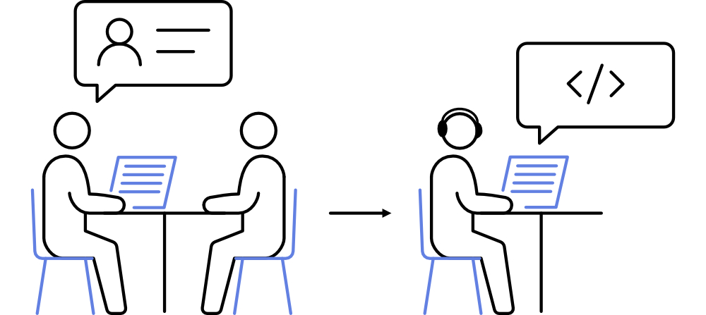
The team ran guerrilla testing in company kitchens. There were three sessions, each in a different kitchen and with different employee groups. Around ten people took part in each session.
The setup was practical. One person approached employees and built a live profile with them in the actual MVP. The profile captured what they could teach and what they wanted to learn. At the same time, a developer listened in and quickly created a matching counterpart profile in the system. The participant could then see a real match appear instead of landing on an empty state.
That test did more than validate the flow. It also created the first real skill vocabulary for the product. The test profiles were deleted after the sessions, but the entered skill tags became seed data for the first suggestion lists. The sessions also helped with early awareness. Each participant received a flyer with a newsletter signup, so the research sessions doubled as lightweight internal promotion before launch.
This case study is framed as a redesign, not as a clean from-scratch product build. The original product had already shipped. For this version, I reconstructed the experience from memory and two original reference screenshots, then rebuilt and improved it in Figma. Since I was the solo designer on the original project, I could safely redesign the experience without exposing the real company, original product name, or internal screenshots.
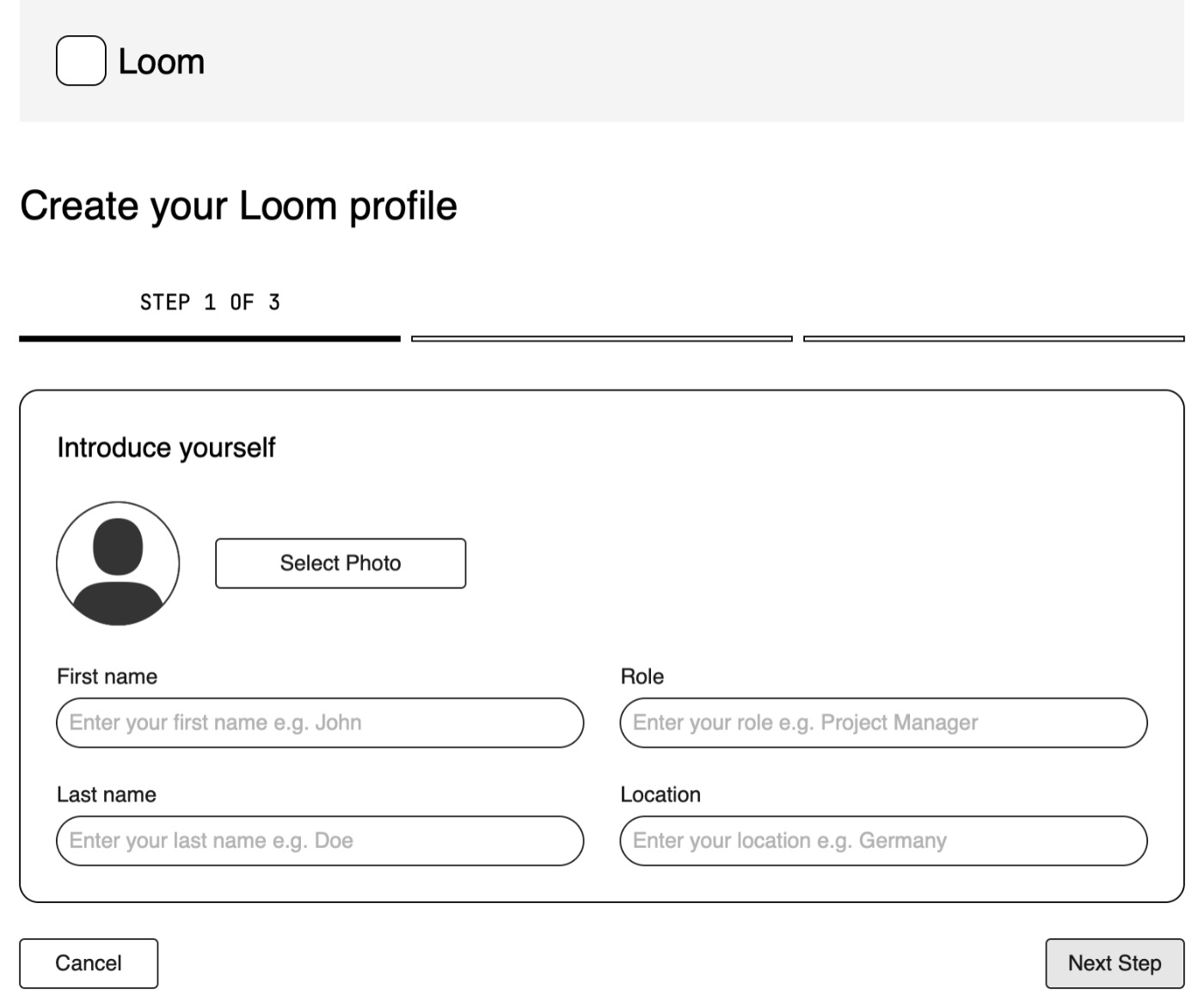
The first step was low-fidelity wireframing. I used wireframes to rebuild the main flows and check page structure before moving into visual design.
Onboarding — Introduce Yourself
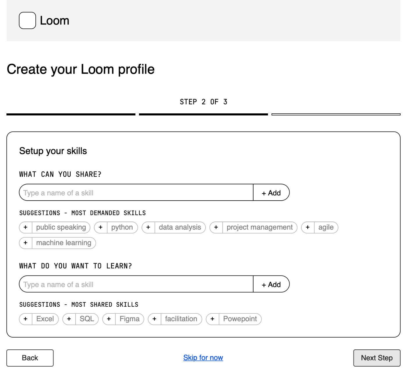
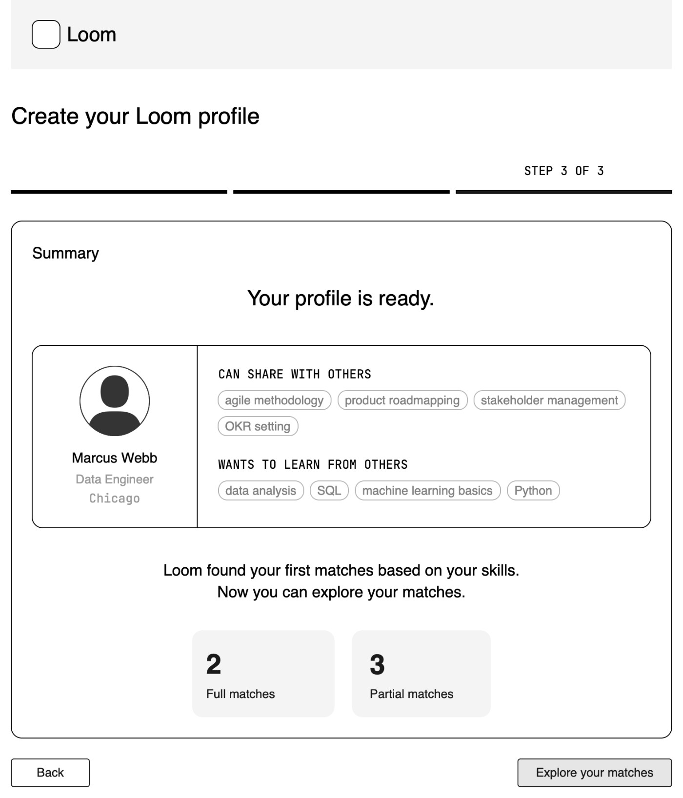

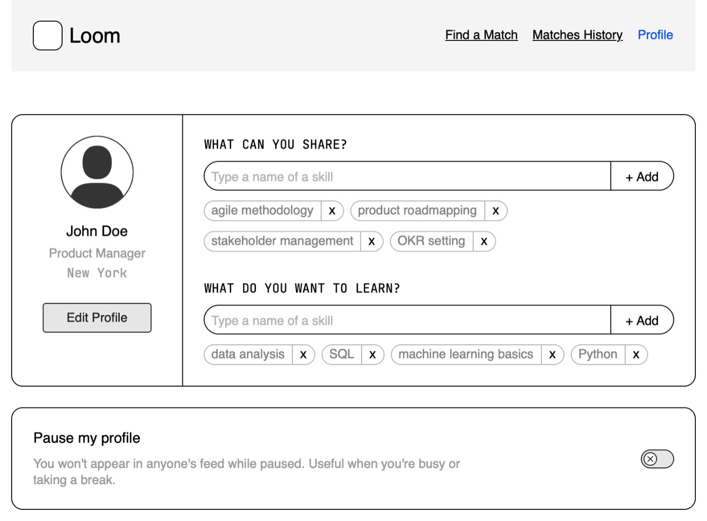
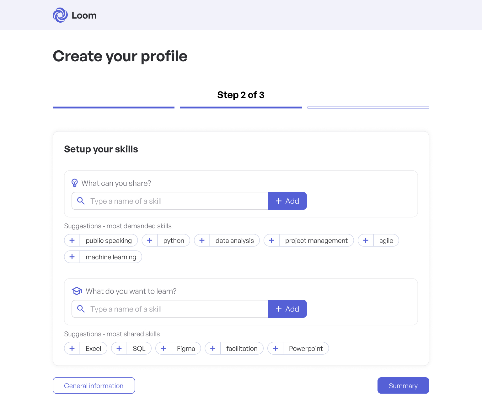
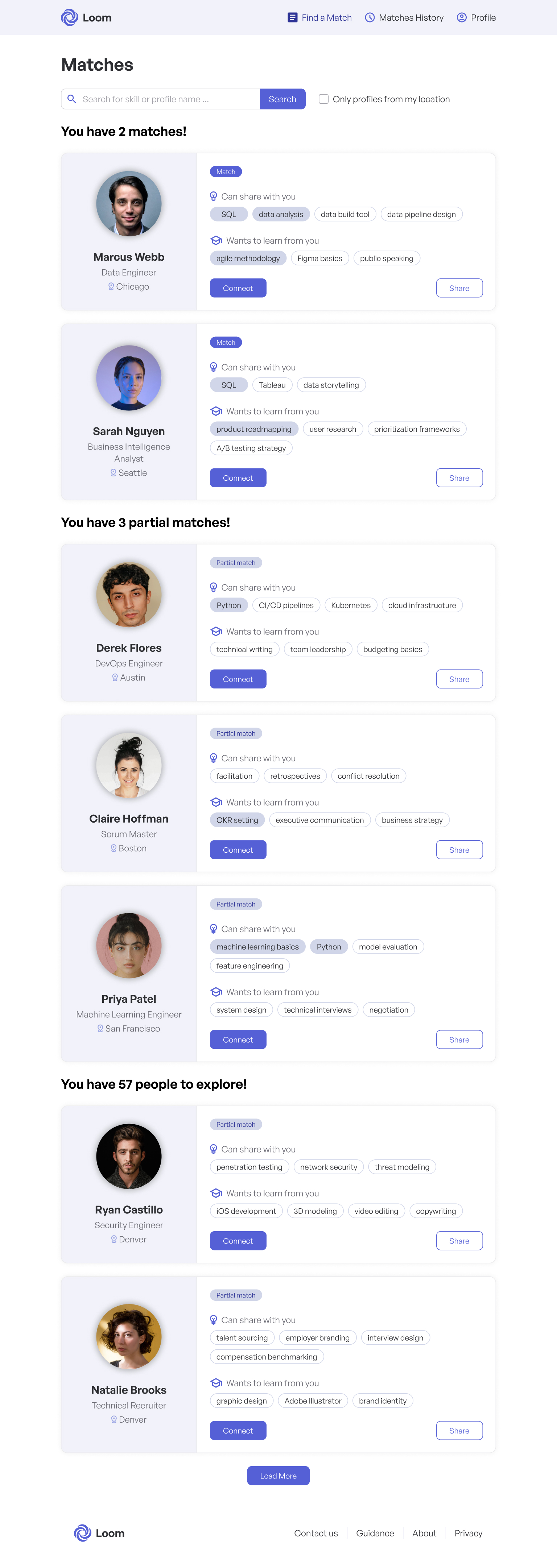
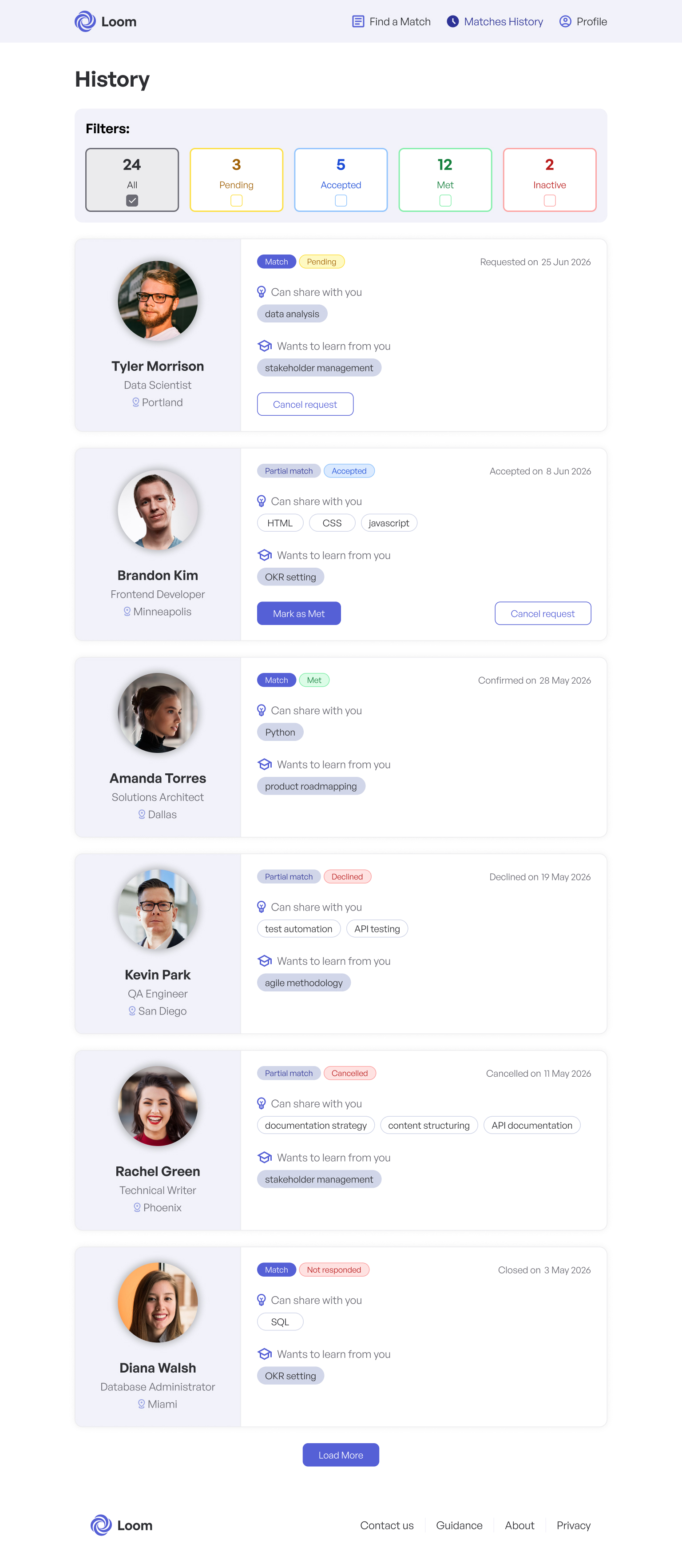
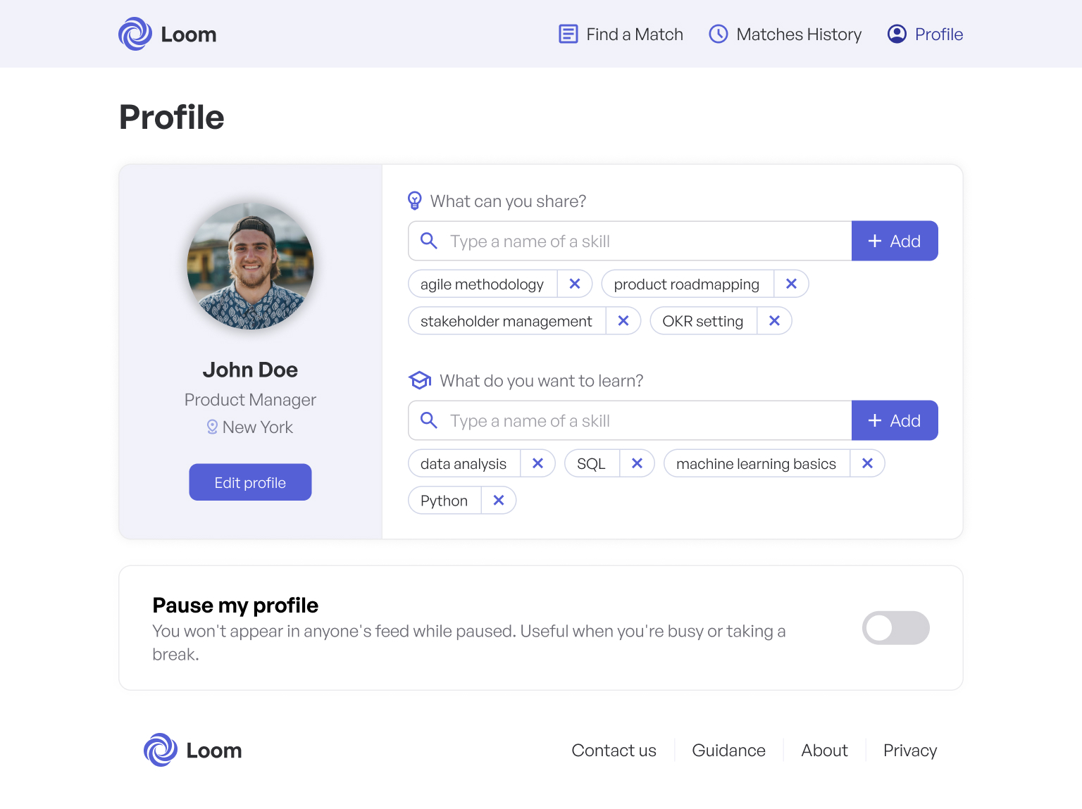
The second step was high-fidelity design in Figma. The final set covers the complete MVP experience.
Onboarding — Step 1
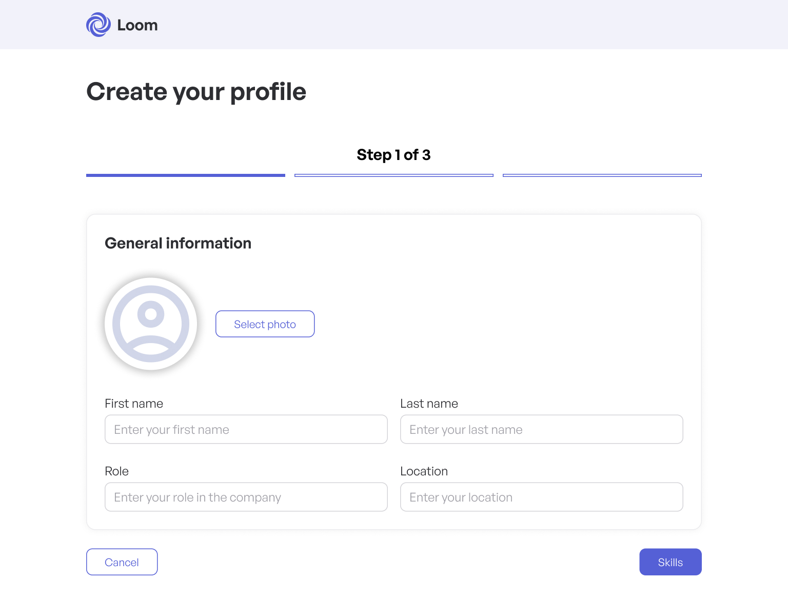

This project stops at high-fidelity design. Unlike Car Plates, this case study does not include a build step. That is the honest scope of this redesign.
Loom does not include chat, calendar booking, or session management. That came directly from research. Users did not expect the app to manage the relationship after a connection was made. The company already used MS Outlook and MS Teams, so adding another communication layer would have created extra work without improving the core match. The product had one job: help people find the right person. After that, employees could use the tools they already had.
Matches History does not behave like a live profile view. When two people connect, the skills shown on the history card are frozen at the moment of connection. This matters because people can update their skills later. Without a snapshot, an old connection could show a different skill set than the one that created the match. It is a small edge case, but the rule keeps history accurate.
People are not permanently removed from the feed after one interaction. If a connection reaches "Met," that person can appear again in the feed, but with a visible marker showing that a previous connection already happened. If a request is cancelled or declined, the person can also reappear, again with the prior attempt shown. The feed stays useful, but it does not erase history.
Free-text skill entry gave users flexibility, but it created a data problem. People described the same skill in different ways. One person might enter "User Experience Design," another might write "UX Design," and someone else might use "UxD." The app had a suggested skill list, but it was optional. It helped, but it did not prevent duplicates. The team had to clean the tags manually on a regular basis.
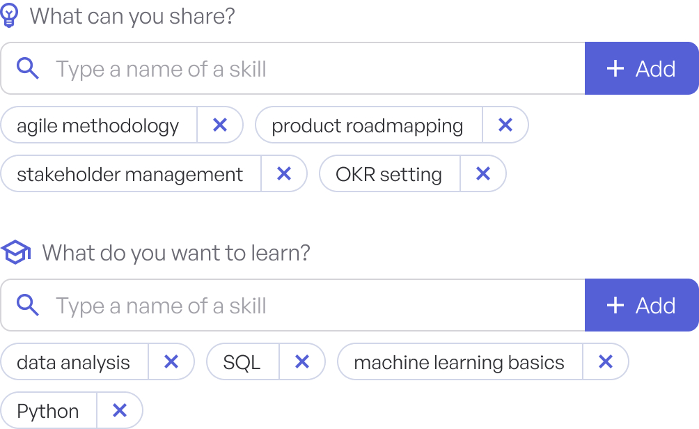
Free-text tags made skill entry flexible, but they also created duplicate variants.
Some users did not know what to write when asked what they could share or what they wanted to learn. That did not mean they had no useful skills. Many people simply struggled to name them cold. Some also felt their own knowledge was too ordinary or too specific to be useful to someone else.
The design response was to add suggestion chips during onboarding. In the "What can you share?" section, Loom showed examples of demanded skills. In the "What do you want to learn?" section, it showed commonly shared skills.
There was a bootstrap problem at launch. The product did not yet have enough real data to generate good suggestions. The first list was seeded from the guerrilla kitchen testing, where employees had already entered real skills into the MVP. As adoption grew, the suggestions could move from seeded data to aggregated data from real profiles.

Suggestion chips helped users start from real examples instead of an empty input field.
Users did not always want to be visible in the feed. Availability changed by person. Someone might be busy during a project phase, away for holidays, or simply not open to new requests for a while. The design response was a "Pause my profile" toggle on the Profile screen. When paused, the user does not appear in other people's feeds. It gives people a clean way to step back without deleting their profile or changing their skills.

The pause control let users step back without deleting their profile.
Loom became a real internal product, not a side project or unused pilot. The app reached hundreds of users and supported around 1,500 completed learning sessions. Continuous discovery and feedback sessions showed strong positive sentiment from employees.
One later finding was especially useful. Some departments wanted closed, department-scoped versions of the app. These departments were large enough to have hundreds or thousands of employees, but they still wanted their own isolated matching space for internal learning. That demand showed that the matching model had value beyond the original company-wide version.