back to portfolio
06/2026
back to portfolio
06/2026
back to portfolio
06/2026
back to portfolio
06/2026
A plate tracker for every twin of your own car.
When me and my family noticed two twins of our car in the neighborhood - same brand, model, and color - our kid proposed a game: every time we saw another one, we would log its plate. I became the scorekeeper.
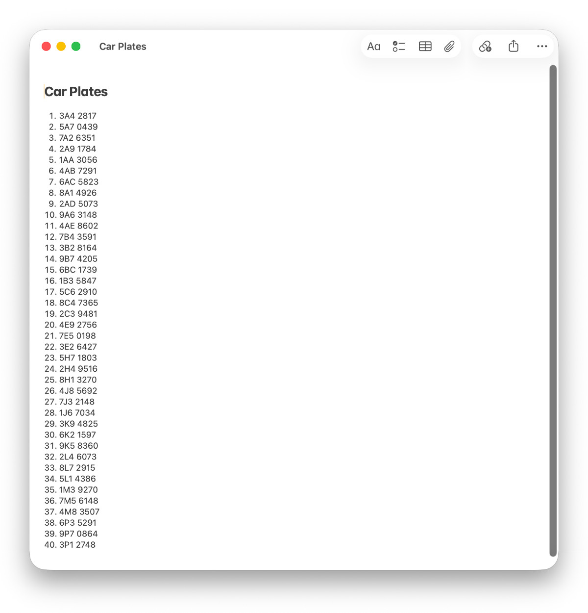
The list lived in iOS Notes app at first. That worked for a while, but the better the game got, the worse the list became. We drive the same routes often, and after enough sightings I could no longer remember which plates were already in. Every new catch meant scrolling through a wall of similar-looking numbers before adding another one.
What I needed was simple: a fast way to store each plate once, and an instant answer when we had already seen it. A small family game had turned into a real product problem.
The iOS Notes app worked while the list was short. Around thirty entries, it started to break down. By fifty, it had become a wall of similar-looking numbers with no real structure. The problem was not storage as Notes could store the list. The problem was everything around the moment of entry.
The app needed to answer one question instantly: is this plate new, or do we already have it?
There were no external constraints. No client, no deadline, no team, no imposed platform. It was a solo app for me and my family, so I could choose everything. I picked native iOS because I wanted to see whether I could vibe-code a native app.
That freedom became the actual constraint. With nothing pushing back, the project could easily grow past the problem it was supposed to solve. So I gave it one rule: get to a working MVP before adding anything else.
The MVP was intentionally small. Enter a plate and get an instant verdict: new or duplicate. That was it. I cut date stamping, even though I knew I wanted it, because it was not needed to prove the core interaction.
Once the core worked in real use, I let the app open up. Date stamping came first. Then came the parts that made it feel more personal: car name, car photo, settings, and color themes. That second phase was less about discipline and more about play, but only after the main thing already worked.
The process moved in four steps: paper, wireframe, Figma, build. Each step added just enough detail to answer the next question.
Paper came first because it got the idea out of my head quickly. The first sketch was almost nothing: a button for adding a plate and a list of stored plates. That was enough to settle the basic hierarchy.

The wireframe kept the same shape but made it more personal. I added the date, car photo, and car name, then checked proportions, tap targets, and placement while everything was still cheap to move. The structure held.
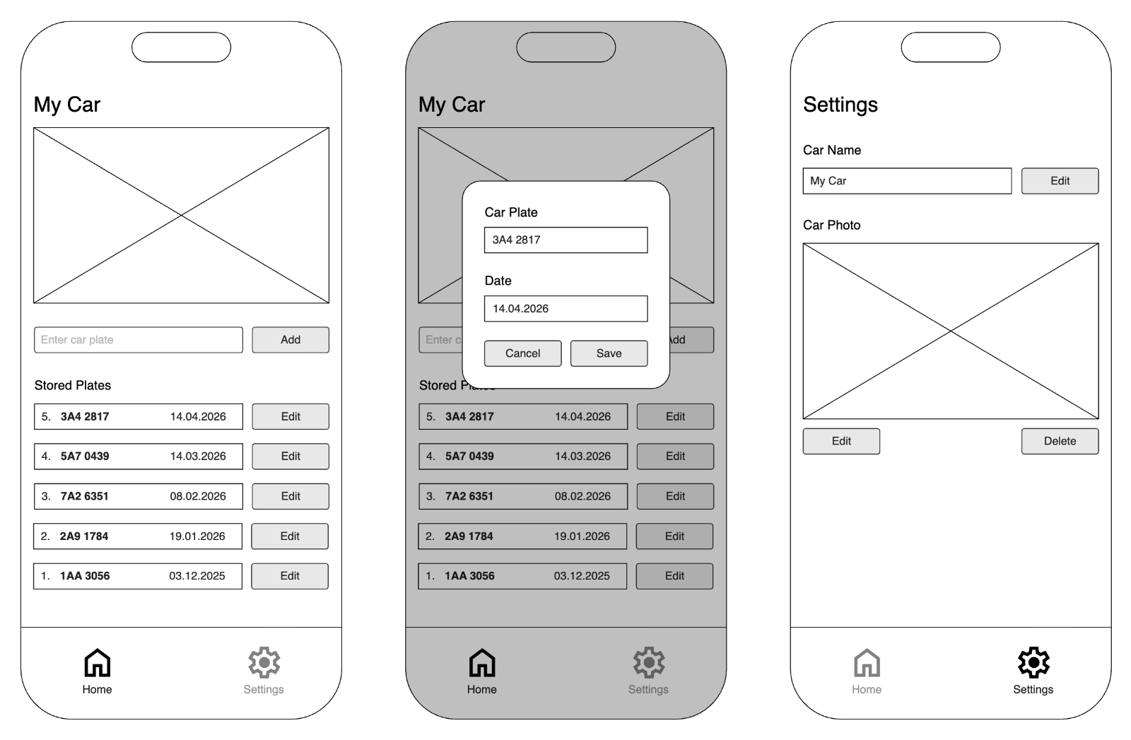
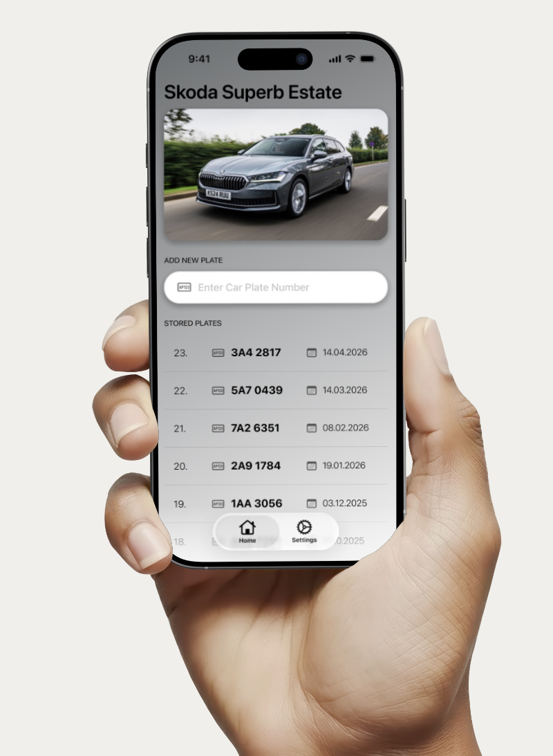
Figma turned the wireframe into a build-ready design. Components, spacing, type, colors, and states were defined there. The grey Škoda Superb Estate theme became the default version, and the color themes were added extra later.
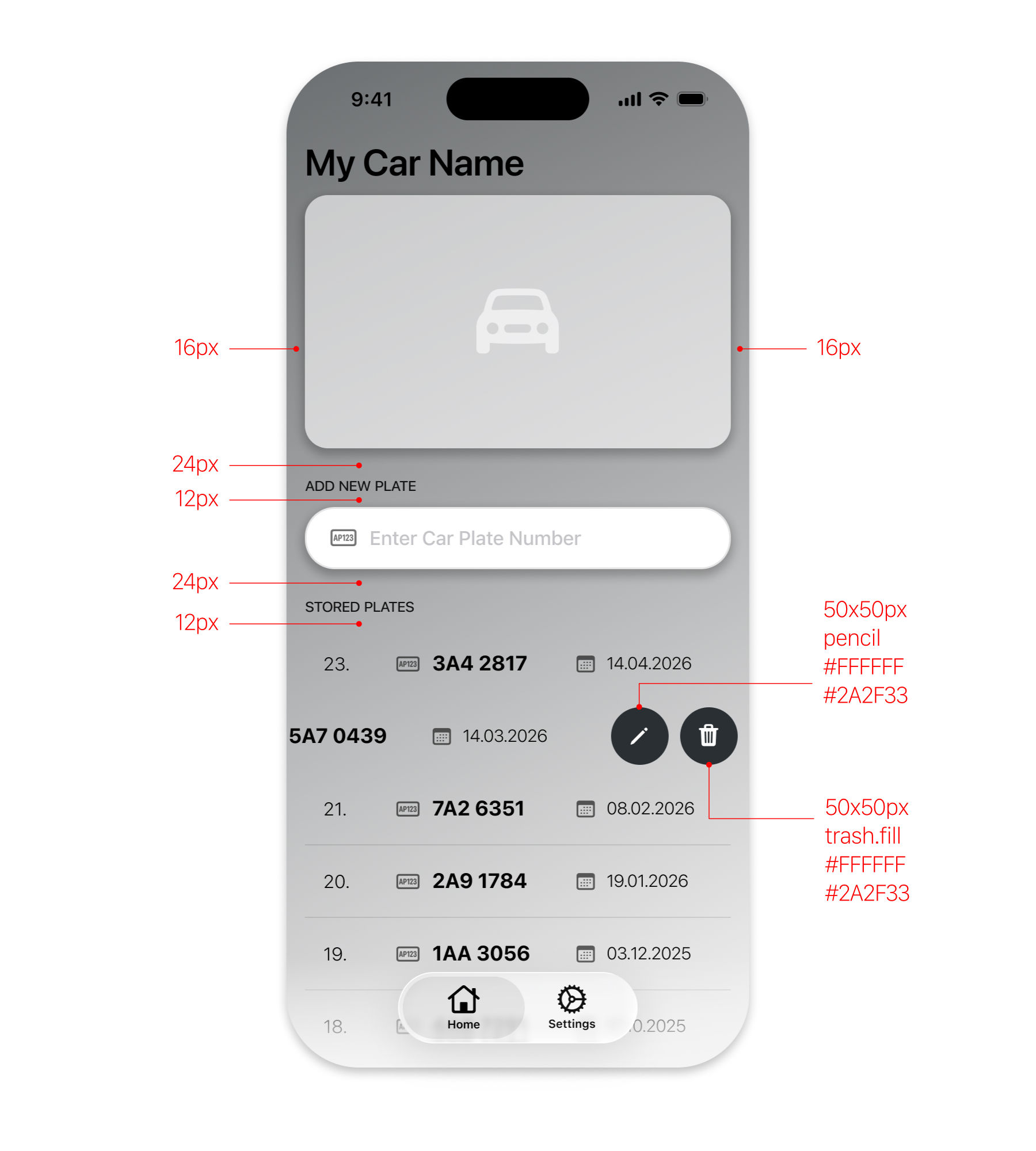
The biggest design change came from date stamping. The first row layout had a visible edit button on every row, but once the date was added, there was no room for both. The edit button was also not strong enough to deserve permanent space. I cut it and gave that space to the date.
Editing moved behind a native iOS swipe action. Swipe a row to reveal edit and delete. Tap edit and the existing plate data opens in a modal. The interaction became cleaner, and the row kept the information it actually needed.

Home Screen
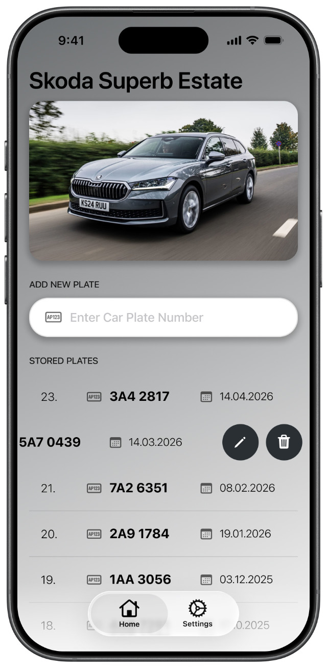
Swipeable Plate
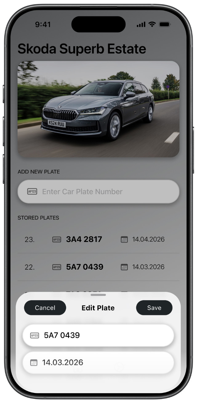
Edit Plate
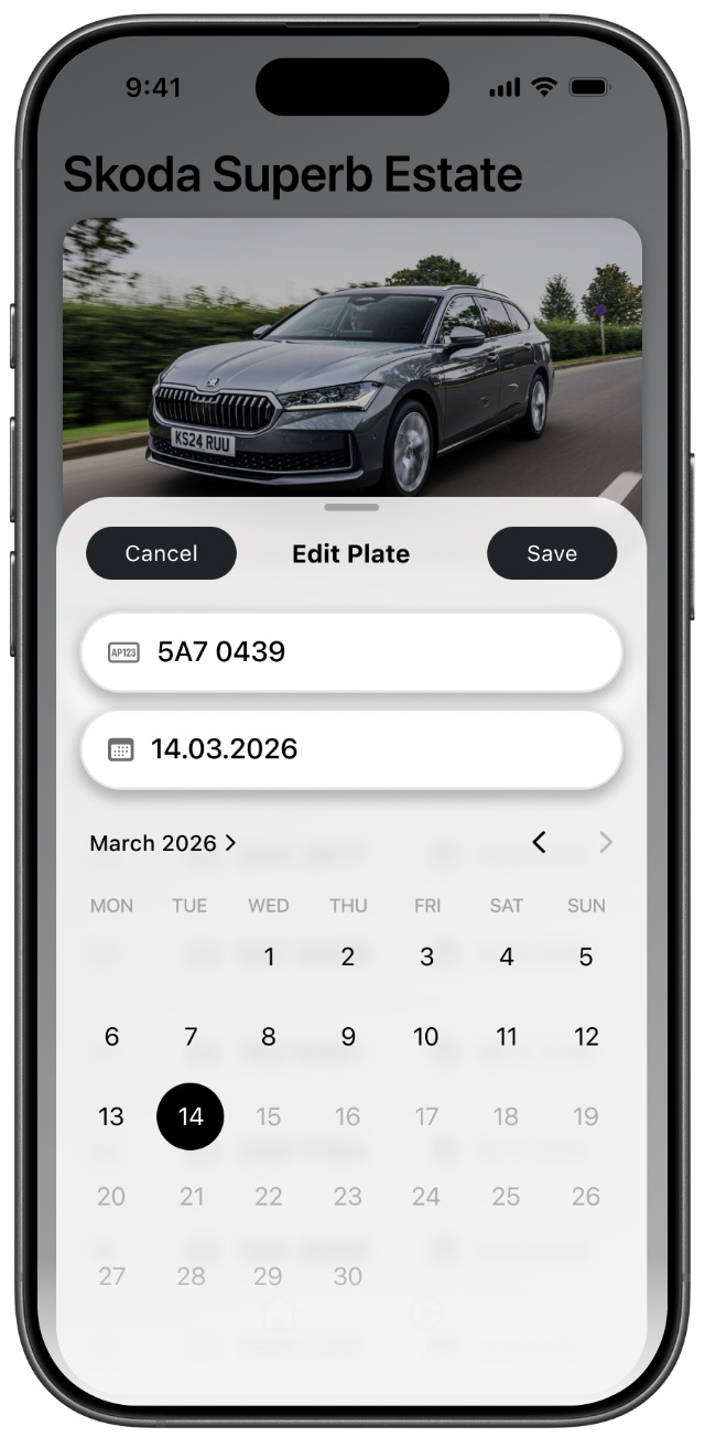
Edit Plate Date
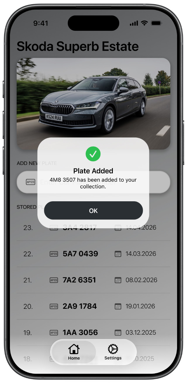
Plate Added
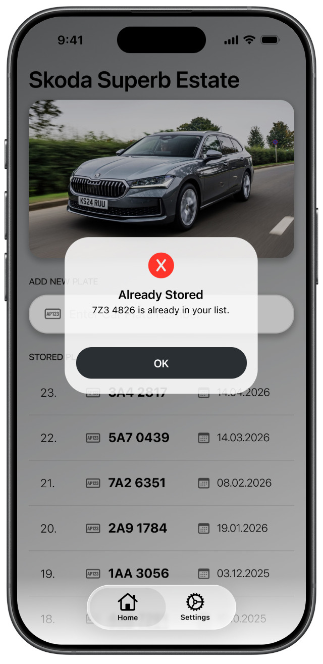
Duplicate Detected
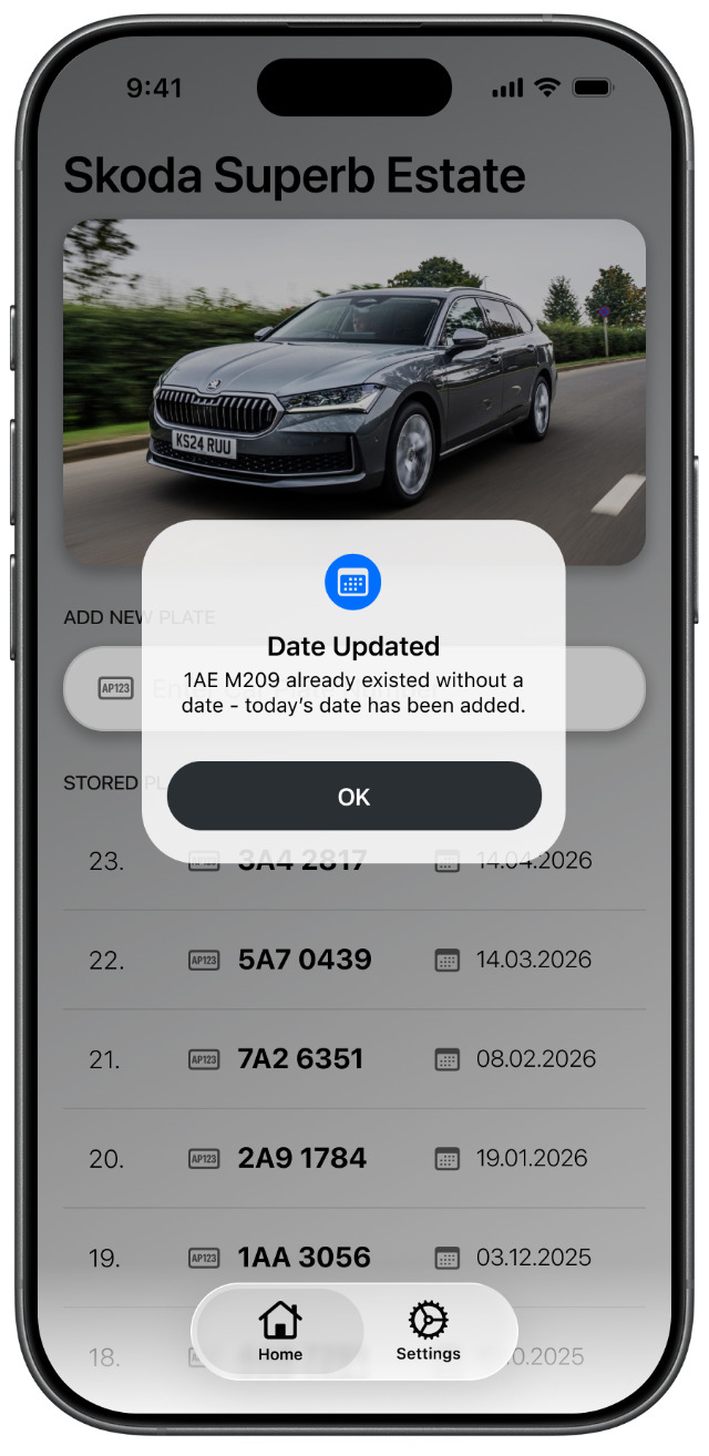
Date Updated
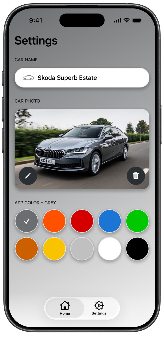
Settings Screen
The build was the final design step, not just production. I had not built a native iOS app before, so the work was iterative: get one thing working, add the next thing, fix what breaks. Figma stayed the source of truth, but the app only became real once the interactions had to survive in code.
The base app is neutral on purpose. Color comes later as a personal layer: ten themes that can match the car, clash with it, or simply make the app feel more yours.
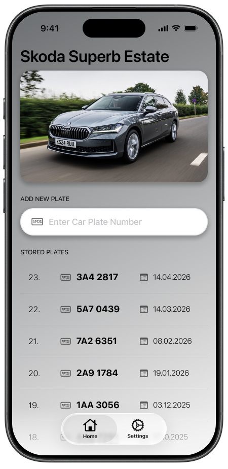
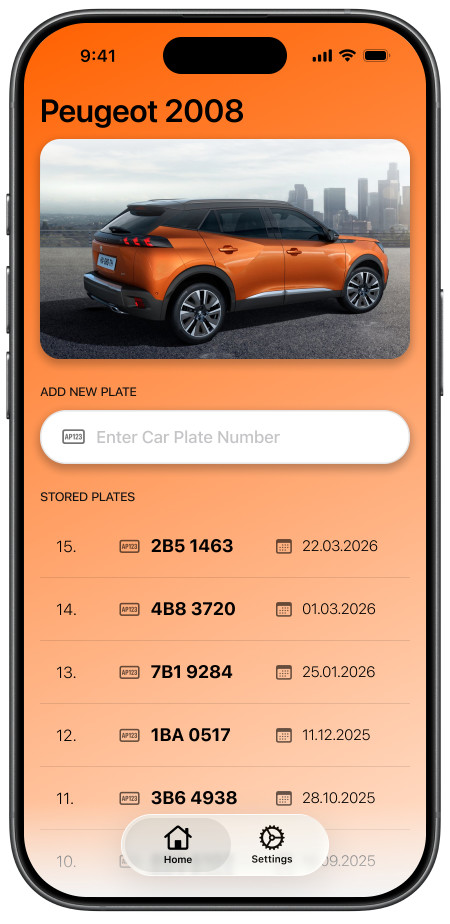

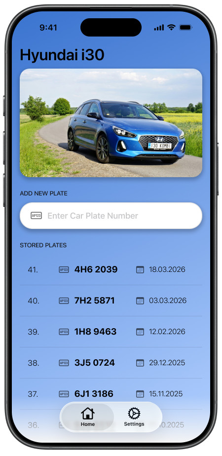

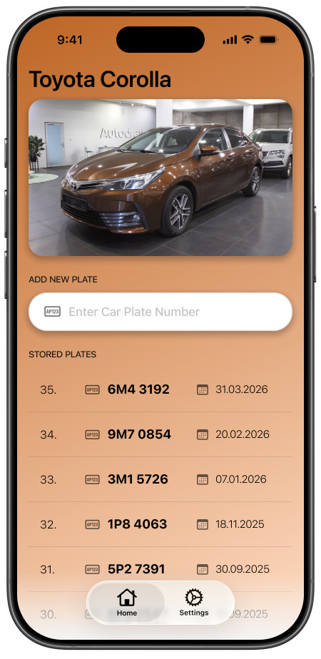
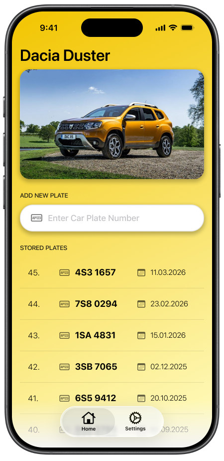


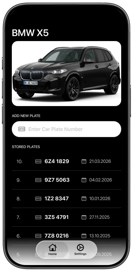
Two decisions shaped the app: keep entry on the home screen, and treat the list row as the core component. Both came from the same need. Logging had to be fast, and the collection had to feel like the point of the game.
The input field lives directly on the home screen. The alternative was an "Add Plate" button that opened a modal with the keyboard ready. On paper, both flows are similar: tap, type, confirm. In use, the modal adds a screen transition and a context switch every time you log a plate. That is too much friction for the app's most important action. The inline field is always there. Tap it, type the plate, hit Enter. No new screen, no extra state to dismiss. For something you may need to do before a car drives off, that small difference matters.
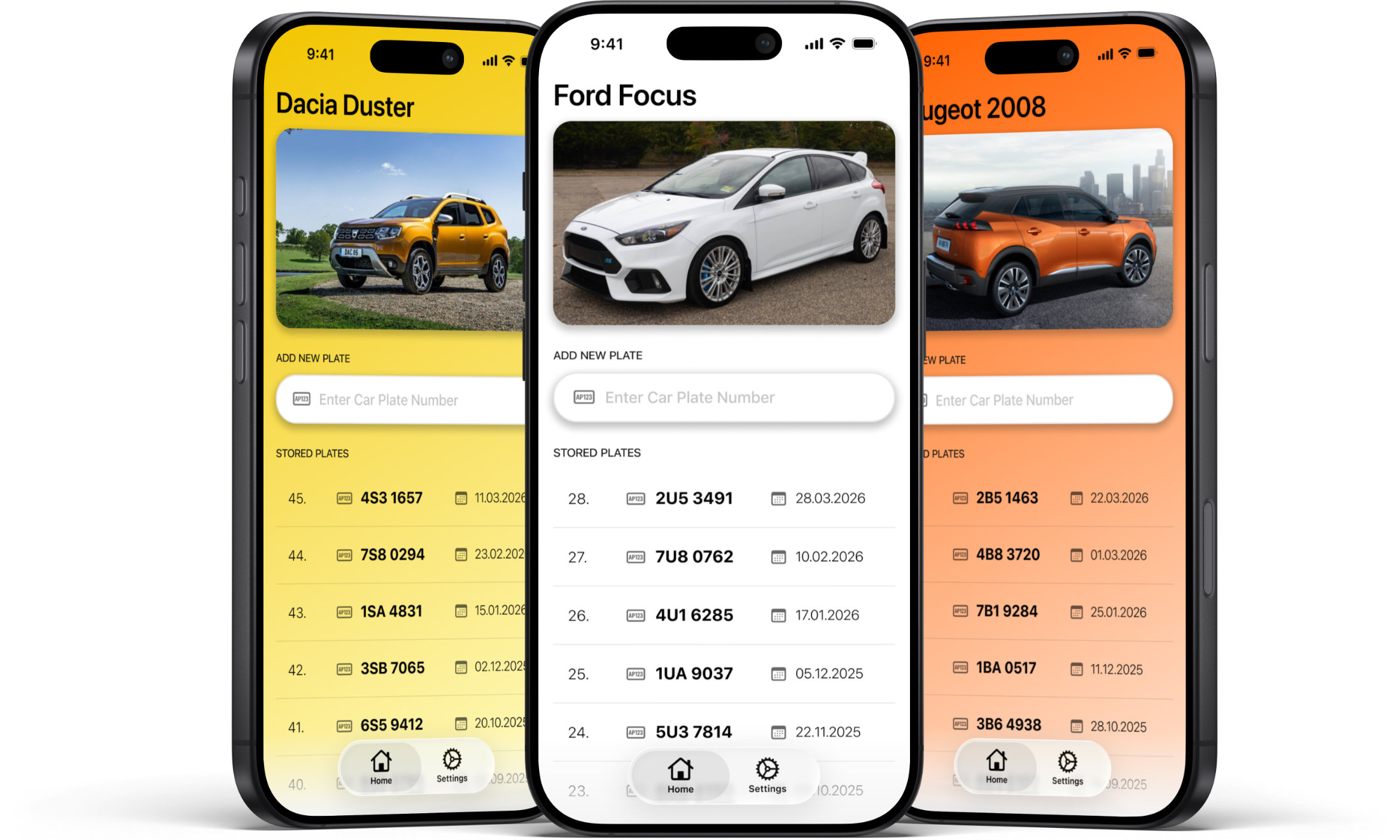
The row became the app's main component because the whole product is a list of plates. Each row has to carry the plate number, date, and position in the collection. Everything else on the screen supports that.
I kept the list as one continuous scroll. No pagination, no grouping, no archive. I kept it that way because the length of the list makes you actually feel the score. Splitting it into pages would make the collection feel filed away. A single scroll lets you feel how many twins we have caught.
There are tradeoffs. The home screen is dense because the car photo, input field, and full list all live together. The list also does not scale for free. At fifty or sixty entries it is fine; at a few hundred it may need windowed loading. I did not design for that yet because I have not hit that problem yet.
Editing is the other tradeoff. The visible edit button was removed so the date had room, and editing moved behind a swipe action. That is a native iOS pattern and the right fit for the row, but it is less discoverable. The fix is probably a one-time hint, not a visible button on every row.
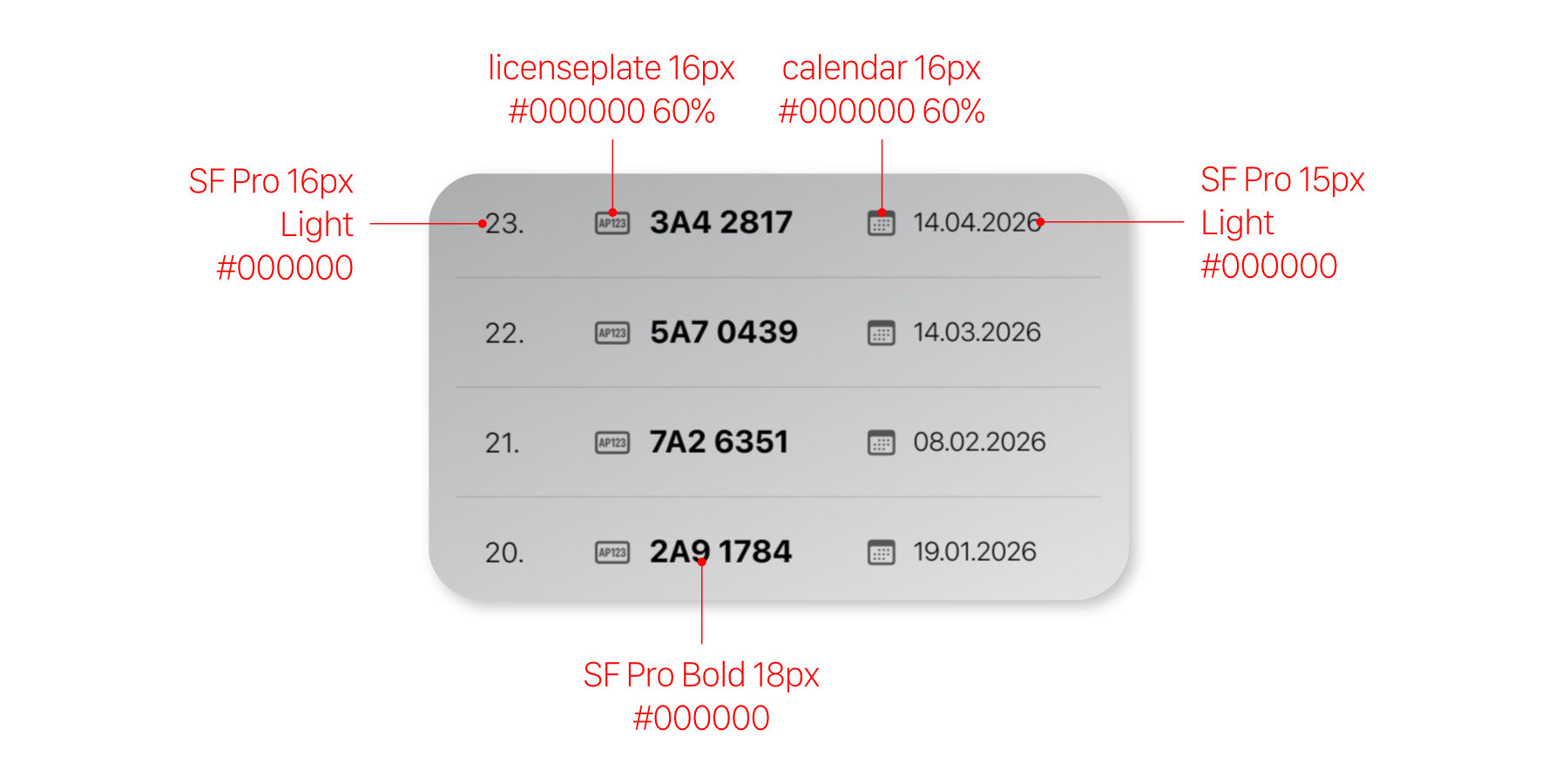
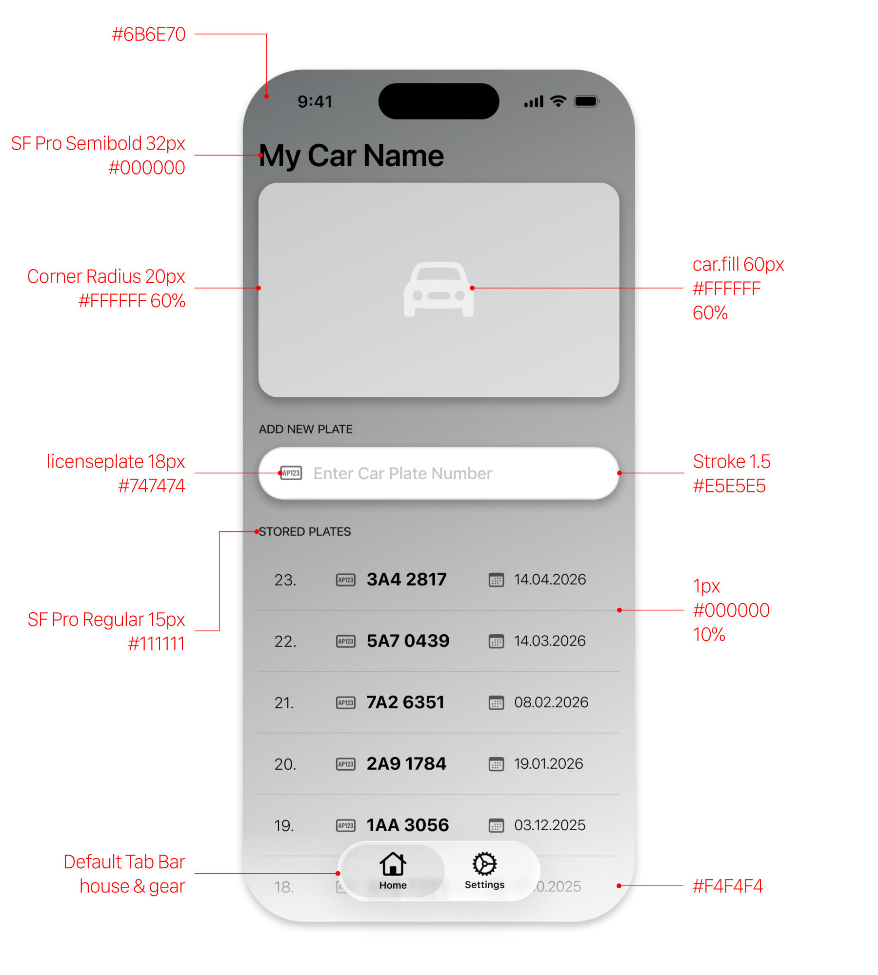
The app uses SF Pro throughout. It is the iOS system font, and that mattered because the app should feel native rather than branded. Hierarchy comes from weight, size, and opacity. The plate number is the heaviest element in the row because it is the thing you came to read. The date and position number sit back.
The default design is greyscale. Black text, grey fills, and a neutral grey Škoda Superb Estate photo. The point was to make the base version feel like a clean skeleton first, with color added later as a personal layer.
The row is the main component. Each one carries the position number, plate icon, plate number, calendar icon, and date. At rest, it is a clean read-only line. Swiped, it reveals edit and delete actions. Tap edit and the row data opens in a modal where the plate and date can be changed.
Themes are manual and separate from the car photo. Settings has ten color options: grey, orange, red, blue, green, brown, yellow, silver, white, and black. Picking one changes the background, header, and accents. I could have tied the theme to the uploaded car photo, but I did not want correctness to decide the look. A black car can use the white theme. A grey car can use orange. The theme is there for expression.
Feedback is intentionally small. When a plate is confirmed, the app gives one of three responses: green for a new catch, red for a duplicate, and blue when an existing plate's date is updated. That is the whole state model for now, and it is enough for the current app.

The app replaced the iOS Notes app. That is the simplest outcome and the one that matters most. I use it in the car, in the moment, when we spot another twin. Since the current version shipped, I have logged ten-plus new plates and updated the date on several existing ones. The old Notes list is no longer part of the game.
The verdict moment works. Type a plate, hit Enter, and the app answers immediately: green for a new catch, red for a duplicate. It feels like winning or losing, which is exactly what the game needed. The continuous list works too. Before entering a new plate, you pass through the collection, and the size of it registers every time.
The app is still fragile in one important way. Every plate lives on one phone. There is no backup, no export, and no sync. If the device is lost or wiped, the whole collection is gone. That is the biggest real weakness in the current version.
Some limits are intentional. The app supports one car because that is what the game needs right now. It has no search because the main question is already answered by entering the plate. Editing is hidden behind a swipe, which costs some discoverability, but that is a row-level interaction issue, not a reason to redesign the screen.
One technical outcome is clear: native iOS was slower to vibe-code than a web app would have been. The app works, but for a project this small, native cost more time than the product required.
The design was straightforward. The problem was clear, the solution was visible early, and the work was mostly execution. I do not see this project as a design breakthrough. It was a clean application of skills I already had.
The experiment was the build. I had never vibe-coded a native iOS app before, and that was one of the main reasons to make it. Now I know what that feels like. It worked, but it was slower than I expected for something this small. I do not regret choosing native because I wanted that answer, but next time I would likely build a small personal tool for the web first.
The main roadmap item is cloud storage. Right now the whole collection lives on one phone, which makes the app fragile. Moving plates to the cloud would solve the backup problem and make the app usable by the whole family, not just by whoever has the scorekeeper phone.
Everything else should wait. The app earned its shape by staying small, and I would rather keep it that way until real use proves that something else is needed.